

Khotot Art Editorial Guide
Abstract Canvas Art Guide: How to Choose Modern Wall Art for Your Space
Choose abstract art with confidence by comparing scale, orientation, color, visual energy, room function, and the real dimensions of the wall.
What Abstract Canvas Art Means
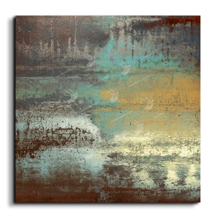
Abstract art uses color, line, texture, shape, rhythm, and empty space without requiring the viewer to recognize a literal scene. Some compositions suggest landscape, architecture, movement, or natural forms; others are deliberately nonrepresentational. This flexibility is why abstract canvas art works in many interiors. It can create atmosphere without forcing the room to revolve around one obvious subject.
In practical design terms, abstract art can anchor a large wall, connect colors already present in the furniture, introduce contrast into a quiet room, or soften a space dominated by straight architectural lines. The right work does not merely fill an empty rectangle. It gives the wall a visual role and helps the furniture, lighting, and surrounding finishes feel intentionally related.
Because abstract art is open to interpretation, buyers often choose too quickly by color alone. A stronger method begins with the room: how large the wall is, how far away the artwork will be viewed, whether the furniture is visually heavy or light, and whether the space needs calm, structure, warmth, or energy.
Why Abstract Art Works in Modern Interiors
Modern rooms frequently combine simple furniture, neutral finishes, and open wall areas. Abstract art can introduce movement and personality without competing with clean architecture. A geometric composition can reinforce order; a gestural painting can loosen a rigid room; a muted color field can add depth while preserving calm.
Abstract wall art is also useful when several people share a space. A literal portrait, landscape, or highly specific subject may strongly reflect one person’s taste. An abstract composition can still be distinctive while leaving more room for interpretation. This makes it practical in living rooms, offices, reception areas, hotels, and meeting spaces.
Choose the role of the artwork before choosing the image: focal point, quiet background, color bridge, architectural counterbalance, or statement piece.
Major Abstract Art Styles
| Style | Visual character | Useful settings |
|---|---|---|
| Geometric | Structured lines, blocks, repetition, controlled contrast | Modern offices, minimal homes, architectural interiors |
| Gestural | Visible movement, sweeping marks, expressive energy | Living rooms, studios, creative offices, feature walls |
| Color-field | Broad areas of color with restrained detail | Bedrooms, calm lounges, spacious contemporary rooms |
| Textured | Layered surfaces and material-like visual depth | Neutral rooms, hospitality spaces, close-view walls |
| Minimalist | Limited palette, simple forms, generous negative space | Small rooms, bedrooms, refined entryways, quiet offices |
| Arabic-inspired abstract | Letter-like rhythm or regional visual references | Contemporary Arab interiors, cultural offices, hospitality projects |
Geometric abstraction
Geometric work is useful when the room already has a strong architectural language. Rectangles, circles, grids, and repeated lines can connect with shelving, windows, stone joints, or furniture profiles. It looks disciplined when the surrounding wall remains uncluttered.
Gestural and fluid abstraction
Gestural work introduces movement. It is often the right response to a room with many straight lines, square furniture, and hard finishes. The painting can visually soften the space, but the size must be generous enough for the movement to remain readable from the main viewing position.
Color-field and tonal work
Color-field art relies on broad tonal relationships rather than many small details. It can create calm, warmth, or depth in bedrooms and quiet living areas. Subtle work benefits from controlled lighting and should not be crowded by shelves or highly patterned accessories.
How to Choose Abstract Wall Art
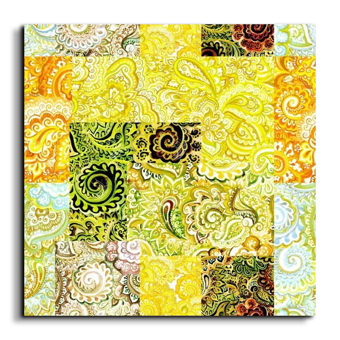
Begin by deciding what the room lacks. A pale neutral room may need contrast. A dark room may need a lighter visual opening. A space with detailed rugs, cushions, and objects may need a calmer painting with broad areas of negative space. A minimal room may benefit from one stronger composition with color or movement.
Next, consider visual density. Dense artwork contains many marks, layers, or changes in color. It creates energy but requires space around it. Quiet artwork has fewer elements and can sit closer to furniture or other objects. Neither is automatically better; the correct density depends on how much visual information already exists in the room.
Finally, compare the artwork’s dominant direction. Horizontal movement helps a seating area feel wider. Vertical movement can emphasize ceiling height. Circular or centered movement can work above square furniture. Diagonal movement adds energy but may feel unstable if the room already contains many competing angles.
Choosing Abstract Art by Room
Living rooms
The living room usually needs the strongest artwork in the home because it is viewed frequently and from several positions. Above a sofa, the canvas should visually relate to the seating width. On a separate feature wall, it can be larger and more independent. Use one primary artwork rather than several unrelated small pieces when the wall is broad.
Bedrooms
Bedrooms generally benefit from lower visual tension. Soft neutrals, blues, earth tones, and restrained movement can support a restful atmosphere. Strong black-and-gold contrast can still work, but it should be balanced by enough wall space and quiet bedding. Above a headboard, confirm the height so the work does not feel pressed against the ceiling.
Offices and meeting rooms
Abstract art can add character without introducing a subject that distracts from professional use. Geometric, architectural, or controlled gestural work is often effective. Behind a desk, the canvas should align with the furniture rather than float as a small object in the center of a wide wall.
Entryways and corridors
Entryways need immediate clarity. A vertical or square piece may suit a narrow wall, while a horizontal work can sit above a console. In corridors, avoid deep visual clutter and choose a composition that remains legible at an angle.
Hospitality interiors
Hotels, lounges, restaurants, and reception areas need artwork that supports the identity of the space from a distance. Scale, glare control, and repeated visual language across several walls matter more than selecting isolated images one at a time.
Choosing Color with Confidence
Do not attempt to match every color in the artwork to the room. A better approach is to connect one or two tones, then allow the painting to introduce contrast. Exact screen colors can vary with device settings, room lighting, and the finished physical product, so the overall palette is more reliable than one precise shade.
Black and gold
Black-and-gold abstract art feels formal and dramatic. It works best with controlled lighting, neutral walls, dark timber, stone, or warm metal accents. Too many gold accessories can make the room feel themed, so let the artwork carry most of the emphasis.
Blue compositions
Blue can feel calm, expansive, or crisp depending on saturation. Soft blue works with beige, grey, white, and natural timber. Deep navy can provide structure in offices and formal living rooms. Pair it with warm materials to prevent the room from feeling cold.
Neutral and earth tones
Beige, sand, taupe, ivory, brown, and muted terracotta are flexible because they connect easily with wood, stone, linen, and plaster. Their success depends on texture and tonal contrast; if every surface has the same value, the room may look flat.
Bold color
Strong red, orange, green, or mixed-color work should usually be the main event. Repeat only a small accent color elsewhere rather than matching the entire room. Large bold artwork benefits from a cleaner wall and simpler nearby objects.
Sizing and Orientation
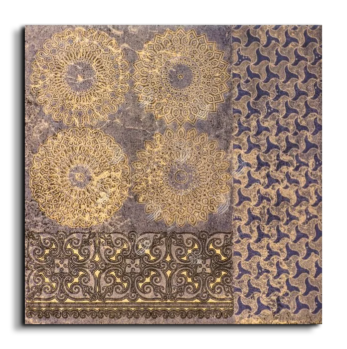
Scale is the most common reason an attractive canvas looks wrong after installation. Buyers often underestimate large walls because product pages isolate the artwork from the real room. Measure the clear wall area, furniture width, ceiling height, and the distance from which the piece will be seen.
| Wall situation | Useful orientation | What to check |
|---|---|---|
| Above a sofa or long console | Horizontal | Relationship to furniture width and side clearances |
| Narrow wall or between openings | Vertical | Ceiling height and comfortable eye level |
| Compact wall above a cabinet | Square | Centered alignment and surrounding accessories |
| Large open feature wall | Large single piece or controlled set | Viewing distance, spacing, and clear hierarchy |
| Gallery arrangement | Mixed only with a plan | Consistent spacing, shared palette, one anchor piece |
Before ordering, mark the proposed dimensions using removable tape or paper. View the outline from the main seat or entrance. This simple test reveals whether the work will feel undersized, crowded, too high, or disconnected from the furniture.
Canvas, Framing, and Product Options
Product formats can differ, so read the live selector and order summary carefully. A room mockup may show a decorative frame, but that does not automatically mean the frame is included. Do not assume that every canvas is supplied in the same rolled, stretched, framed, or gallery-wrapped format. The option selected at purchase is the controlling information.
When choosing between formats, consider local installation, shipping, edge appearance, and whether a surrounding frame is important to the room. A clean canvas edge can suit a contemporary interior, while a defined frame may suit a formal wall. The decision should support the composition rather than crop or visually compress it.
Placement and Lighting
Hang the artwork in relation to the furniture, not the wall alone. Above a sofa or console, the vertical gap should feel connected rather than floating. On an open wall, use the main viewing axis and average eye level as a starting point, then adjust for ceiling height and furniture.
Lighting should reveal the composition without glare. Side lighting can emphasize texture, while even ambient lighting helps color-field work. Avoid harsh reflections and prolonged direct conditions that could affect printed artwork. In darker rooms, verify that the chosen palette remains visible at night, not only in daylight.
Pairing Abstract Art with Furniture and Materials
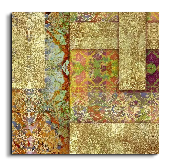
Abstract canvas art works well with timber, stone, linen, leather, plaster, glass, and metal because it can echo either the texture or geometry of those materials. The goal is connection without repetition. A fluid painting can soften a stone wall; a geometric canvas can organize a room with curved furniture; a warm neutral piece can bridge light upholstery and dark wood.
Keep the hierarchy clear. If the artwork is bold, simplify nearby accessories. If the artwork is quiet, a sculptural lamp or textured console can share the wall. Avoid placing several equally strong objects beneath a complex canvas. The eye needs to understand what leads and what supports.
Featured Abstract Canvas Art
These examples show how square and near-square compositions create different levels of movement, contrast, and calm. Review the live dimensions and product options before choosing.
Modern Abstract Canvas I
Modern Abstract Canvas II
Modern Abstract Canvas III
Common Mistakes to Avoid
- Choosing only by color without considering scale or visual energy.
- Buying a small canvas for a large wall because the product thumbnail looked substantial.
- Assuming the room mockup proves the actual dimensions or included framing.
- Placing a highly detailed work in a room that is already visually busy.
- Hanging the canvas too high or too far from the furniture beneath it.
- Using several unrelated abstract styles on one wall without hierarchy.
- Matching every accessory to the artwork and creating an overly themed room.
- Ignoring night lighting and glare.
Frequently Asked Questions
How do I choose abstract art for a living room?
Measure the wall and sofa, decide whether the room needs calm or contrast, and choose an orientation that relates to the furniture. The artwork should have one clear role rather than simply match cushions.
What colors are easiest to style?
Neutral, earth, blue, black, white, and restrained gold palettes are flexible, but the best choice depends on the room’s light, finishes, and existing visual density.
Should abstract art match the sofa?
It does not need to match exactly. Connecting one or two tones is enough. Contrast often makes the room feel more intentional than perfect color matching.
How large should artwork be above a sofa?
Use the sofa width as a visual reference, then test the listed artwork dimensions on the wall. The piece should feel connected to the seating without overwhelming the available clear wall.
Is the frame shown in a mockup included?
Not automatically. Treat mockups as styling references and use the selected product option and order summary to confirm what is included.
Conclusion: Choose Scale, Atmosphere, and Composition Together
The most successful abstract artwork is not simply the image with the most attractive colors. It is the piece whose scale, orientation, visual energy, and palette solve the needs of the real room. Start by measuring, decide what atmosphere the space needs, compare how the artwork moves across the canvas, and confirm the actual product format before ordering.
When those decisions are made in the right order, abstract canvas art can connect furniture, architecture, lighting, and personal taste without making the room feel overdesigned.
Explore Abstract Canvas Art
Browse the collection, compare compositions and dimensions, and choose a piece that gives your wall the right scale and atmosphere.